How to Read Your Plan Analytics and Momentum Score
Understand the six Plan Analytics metrics — Momentum Score, Weekly Velocity, Overdue Rate, Focus Hours, Goal Progress, Overcommitment Rate — and use them to drive behavioral adjustments.
How to Read Your Plan Analytics and Momentum Score
Operational Directive
Plan Analytics is the performance intelligence layer of the Plan Module — a set of six metrics that collectively measure whether your execution is healthy, whether your goals are on track, and whether your weekly output is accelerating or decelerating. This guide explains every metric, how it is calculated, what a healthy baseline looks like, and how to use the data to make specific behavioral adjustments.
Section ProtocolWhy Quantifying Execution Matters
Most productivity systems offer you a place to list your tasks, set your goals, and log your habits. Very few offer you a mirror — a live, quantified reflection of whether your actual output matches your stated intentions. This gap between what people plan to do and what they actually do is the single largest source of frustration in personal productivity, and it persists largely because people don't measure it.
Plan Analytics closes this gap. It doesn't tell you what to do — your Plan Module already holds that information in your task lists, goals, and milestones. What Analytics tells you is how faithfully you are executing against what you planned, and whether that execution is improving or declining week over week.
The distinction matters enormously in practice. A system that only holds your plans is a fancy to-do list. A system that holds your plans and measures your execution against them is a performance intelligence tool. The analytics panel is what transforms JeevanAxis from the former into the latter.
There are six metrics in Plan Analytics. Each measures a different dimension of execution health. Together, they create a complete picture that is more accurate than any single number could be. This guide walks through each one in full detail.
Section ProtocolMetric 1: The Momentum Score
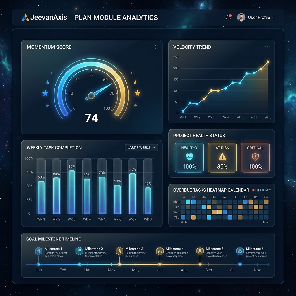
The Momentum Score is the headline metric of Plan Analytics — a single number between 0 and 100 that represents the overall health of your execution system at this moment in time. It is displayed as a prominent gauge at the top of the Analytics panel, colored from red (0–39) through amber (40–69) to green (70–100).
TACWhat It Measures
The Momentum Score is a composite index. It does not measure any single thing — it aggregates four underlying signals into a weighted average:
- ▶Task Completion Rate (35% weight): The percentage of planned tasks you completed during the current week
- ▶Deadline Adherence (25% weight): The percentage of completed tasks that were finished on or before their due date
- ▶Streak Continuity (20% weight): Whether your daily execution streaks for key habits and tasks are unbroken
- ▶Weekly Velocity Trend (20% weight): Whether your output this week is higher, equal to, or lower than your 4-week rolling average
TACWhat a Healthy Score Looks Like
A score of 70 or above is the target for healthy execution. This doesn't mean perfect — a score of 70 means approximately 3 out of every 4 planned tasks are completed on time, streaks are mostly intact, and this week's output is at or above recent averages. That is a realistic standard for sustained high performance without burnout.
Scores between 40 and 69 indicate a system under stress. Something is consistently slipping — you are overcommitting, your energy levels are mismatched to your task load, or external disruptions are regularly interrupting execution. The score in this range is a prompt to investigate, not a judgment.
Scores below 40 are a clear signal that the execution system needs a deliberate reset. This typically means: reduce the number of active tasks, revisit your weekly planning session, and focus on restoring streak continuity before adding new commitments.
TACHow to Use the Momentum Score
The single most important behavior around the Momentum Score is to look at it at the same time every week — ideally during your Weekly Review session. The goal is not to maximize the number — it is to understand the direction. Is it trending up, steady, or declining? A score of 65 that is trending up from 48 three weeks ago tells a very different story than a score of 65 that has been declining from 82.
Section ProtocolMetric 2: Weekly Velocity
Weekly Velocity is the raw output metric — the total number of tasks you completed this week, compared against your 4-week rolling average. It answers the most fundamental question in execution measurement: Are you getting more done this week than usual, or less?
TACReading Velocity Signals
- ▶Acceleration (this week > rolling average): Your output is increasing. This can signal a productive streak, a particularly clear week, or the compounding effect of consistent habits. Sustain it, but watch for the overcommitment trap — acceleration driven by longer hours is not sustainable.
- ▶Steady State (this week ≈ rolling average, within ±10%): You are executing at your baseline. This is perfectly healthy if the baseline itself is strong. Check your Momentum Score to confirm.
- ▶Deceleration (this week < rolling average by >15%): Output is declining. The key diagnostic question is: is this planned (a lighter week intentionally scheduled) or unplanned (disruptions, illness, overcommitment on the wrong tasks)? If unplanned, this is the early warning signal that the Momentum Score will decline next week if nothing changes.
The Weekly Velocity metric is displayed as a bar chart in Plan Analytics — this week's bar vs. the 4-week average line. The visual gap between the two is more informative than either number in isolation.
Section ProtocolMetric 3: Overdue Rate
Your Overdue Rate is the percentage of tasks that passed their scheduled due date without being completed. It is one of the most honest metrics in the analytics panel because it is completely binary and non-gameable: a task either met its deadline or it did not.
TACThe Target Threshold
The healthy target for Overdue Rate is below 15%. In practical terms, this means that out of every 20 tasks you schedule with a deadline, no more than 3 should miss that deadline. This accounts for the realistic unpredictability of any knowledge worker's week — interruptions happen, estimates are wrong, priorities legitimately shift.
An Overdue Rate above 25% is a diagnostic signal with a specific meaning: your deadline-setting behavior is systematically miscalibrated. Either you are setting arbitrary deadlines that don't reflect real constraints, you are underestimating task complexity, or you are scheduling too many tasks for your actual available time.
TACWhat a High Overdue Rate Indicates
A persistently high Overdue Rate almost never means you are lazy or undisciplined. It almost always means one of three things:
- ▶Deadline inflation: You are setting deadlines on tasks that don't have real external deadlines, making those deadlines feel negotiable and easy to ignore.
- ▶Underestimation: You consistently estimate tasks will take less time than they actually do.
- ▶Overloading: You are planning more tasks per day than your available hours can accommodate.
The corrective action for each of these is different — deadline inflation requires audit and pruning, underestimation requires building buffer time into estimates, and overloading requires reducing weekly task commitments.
Section ProtocolMetric 4: Focus Hours
Focus Hours is the total number of hours of tracked deep work you have logged this week via the Focus Engine. Every focus session started through JeevanAxis — whether via Cmd+K → start focus session or the Focus Module directly — is automatically counted here.
TACThe Recommended Minimum
For knowledge workers, the research-backed recommendation is 10–15 hours of deep work per week as a sustainable baseline. This represents 2–3 hours of focused work per working day, which accounts for the overhead of communication, meetings, administrative tasks, and recovery.
- ▶Below 10 hours/week: Output quality tends to suffer because complex, high-value tasks require unbroken focus to reach the depth needed for excellent work. Surface-level tasks get done but the transformative work doesn't progress.
- ▶10–15 hours/week: The sustainable zone for most knowledge workers. Deep work is consistent, output quality is high, and the work is completable without extreme hours.
- ▶Above 20 hours/week: Possible for short bursts (deadline weeks, project sprints) but not sustainable as a baseline. Monitor for signs of depletion: declining Momentum Score, rising Overdue Rate, and increasing session cancellations.
Focus Hours is the only metric in Plan Analytics that is directly controlled by a deliberate daily habit — the habit of scheduling and protecting focus blocks. If this number is chronically low, the first intervention is calendaring: block 2-hour focus windows in your calendar before meetings and other commitments fill those slots.
Section ProtocolMetric 5: Goal Progress
Goal Progress measures the ratio of milestones hit vs. milestones planned across all active goals in your Plan Module. If you have 3 active goals with a combined 15 milestones, and 9 of those milestones are in the past, and 7 of them have been marked complete, your Goal Progress score is 7/9 = 78%.
TACReading the Goal Health Indicators
Each active goal has its own health indicator displayed in the Goals panel:
- ▶On Track (green): Milestone completion rate is within 10% of the expected pace given the goal timeline.
- ▶At Risk (amber): The goal is 10–25% behind expected pace. Requires a plan adjustment — either reducing scope, extending deadline, or increasing weekly time allocation.
- ▶Off Track (red): The goal is more than 25% behind expected pace. Requires a deliberate re-evaluation: Is this goal still relevant? Is the timeline realistic? Is there a resourcing problem?
The most important discipline around Goal Progress is distinguishing between goals that are behind because of a planning error and goals that are behind because of a behavioral gap. A planning error (the original timeline was unrealistic) is corrected by adjusting the plan. A behavioral gap (you are not allocating enough weekly time to this goal) is corrected by behavior change. Confusing the two leads to either over-ambitious plans that repeatedly fail or under-ambitious plans that fail to challenge you.
Section ProtocolMetric 6: Overcommitment Rate
The Overcommitment Rate measures the percentage of weeks during the last 8 weeks where your scheduled task hours exceeded your declared capacity. If you work 40 hours per week and you scheduled tasks that would collectively require 52 hours to complete, that week is flagged as overcommitted.
TACWhy This Metric Exists
Overcommitment is the root cause of more productivity system failures than almost any other variable. When you schedule more than your available time can accommodate, every metric in your system degrades: Overdue Rate rises, Momentum Score drops, Focus Hours fall (because reactive work crowds out deep work), and Goal Progress slows.
The Overcommitment Rate makes this pattern visible. An overcommitment rate above 30% (more than 2–3 weeks out of every 8) is a structural problem, not a motivation problem. The solution is not to try harder — it is to systematically reduce your weekly task commitments until the scheduled hours fall below your actual capacity.
Section ProtocolHow to Read the Weekly Task Completion Bar Chart
Below the six headline metrics, the Plan Analytics panel displays a weekly task completion bar chart showing the last 8 weeks of data. Each bar represents one week and is divided into two segments: completed tasks (solid fill) and planned-but-not-completed tasks (outline or lighter fill).
How to read this chart effectively:
- ▶Look for the trend direction, not the absolute bar height. A rising trend of completed tasks (even if the numbers are modest) indicates a healthier system than a flat or declining trend with high absolute numbers.
- ▶Look for the planned-vs-actual gap. If the outline segment (planned but not done) is consistently larger than the solid segment (completed), your weekly planning sessions are systematically over-ambitious.
- ▶Look for outlier weeks. A single bar that is dramatically lower than the surrounding bars usually corresponds to a specific disruption — travel, illness, a major deadline that crowded out everything else. Single outliers are normal. Multiple consecutive outliers are a signal.
Section ProtocolHow to Use Analytics to Make Behavioral Adjustments
The most important thing to understand about Plan Analytics is that observation without action produces no change. Many users check their analytics, feel the mild anxiety of a declining score, and then return to doing exactly what they were doing before. The data only creates value when it is translated into a specific behavioral experiment.
Here is the diagnostic framework:
- ▶If Momentum Score is declining: Look at which of the four inputs is dragging it down. Is it completion rate (overcommitment) or deadline adherence (underestimation) or streaks (habit neglect) or velocity trend (less output than usual)?
- ▶If Overdue Rate is high: Audit your last 10 overdue tasks. What do they have in common? Are they all from one project (scope problem), all estimated at the same time (scheduling pattern problem), or all of a particular type (energy level mismatch)?
- ▶If Focus Hours are low: Count how many scheduled focus blocks you cancelled or pushed during the week. What was the pattern of interruptions? Calendar blocking is the intervention — protect focus blocks the way you would protect a meeting with your most important client.
- ▶If Goal Progress is off track: For each at-risk or off-track goal, calculate: how many hours per week does this goal require to get back on pace? Then ask: where do those hours come from, given my current commitments?
⚠Common Traps
Section ProtocolThe Feedback Loop: Analytics → Intelligence Center → Behavioral Change → Improved Analytics
Plan Analytics does not work in isolation. It is integrated with the Intelligence Center — the AI-driven insights panel in JeevanAxis that analyzes your analytics data over time and generates specific, contextualized recommendations.
The integration works as follows: after each week of data is collected, the Intelligence Center runs pattern analysis across your six metrics, compares your current week to your trailing 8-week history, and generates a weekly insight card. This card is different from the raw metrics because it interprets the data — it tells you not just what happened, but what pattern it represents and what specific behavioral change is most likely to produce improvement.
For example, if your Overdue Rate has been above 20% for 3 consecutive weeks, and the overdue tasks are clustered around a specific type (all of them estimated at under 30 minutes), the Intelligence Center will surface this pattern explicitly: "Your last 3 weeks show a recurring pattern of small tasks missing deadlines. This often indicates underestimation on quick tasks — consider adding a 15-minute buffer to any task you estimate under 30 minutes."
This specificity is what makes the feedback loop powerful. The cycle is: analytics surface the pattern → Intelligence Center names the pattern and recommends an action → you try the action for one week → analytics show whether it worked. Each iteration of this loop builds a more accurate model of your own execution patterns, which over time makes the recommendations more precise and the behavioral interventions more effective.
✓Plan Analytics Mastery Checklist
Reflect on Your Execution Data
Executive Summary
▸Plan Analytics is a six-metric execution intelligence system built into the Plan Module of JeevanAxis.
▸The Momentum Score (0–100) is the composite headline metric, combining task completion rate, deadline adherence, streak continuity, and velocity trend into a single indicator of execution health — healthy is 70 and above.
▸Weekly Velocity shows whether output is accelerating or decelerating relative to your 4-week rolling average.
▸Overdue Rate reveals the health of your deadline-setting behavior, with a target below 15%.
▸Focus Hours quantifies your tracked deep work, with 10–15 hours per week as the recommended minimum for knowledge workers.
▸Goal Progress measures milestone completion against milestone plan across active goals.
▸Overcommitment Rate shows how frequently your scheduled task hours exceeded your declared capacity.
▸All six metrics feed into the Intelligence Center, which generates specific pattern-based recommendations that close the loop between observation and behavioral change.
▸The most important practice is a structured weekly analytics review — 15 minutes, same time every week — where you read all six metrics together and make exactly one behavioral commitment for the coming week.
Intelligence Pipeline
Use the Intelligence Center →
Learn how the Intelligence Center transforms your raw analytics data into pattern-based behavioral recommendations — and how to evaluate and act on those recommendations effectively.
Master the Focus Engine →
Understand how to configure deep work sessions, maximize your Focus Hours metric, and use session logs to identify your peak productive hours throughout the day.
Run a Weekly Planning Session →
Follow the JeevanAxis 4-step weekly planning protocol — review, purge, prioritize, schedule — that keeps your Momentum Score high and your Overcommitment Rate low week after week.
Connected Intelligence
Ready to Deploy Your Life OS?
Experience the full power of integrated intelligence. Stop managing apps and start operating your life.
Launch Command Center